RELAUNCHING
RAFFLE HOUSE
Categories: BRAND IDENTITY, WEB DESIGN, ART DIRECTION, SOCIALS

Direct access to us, the partners.
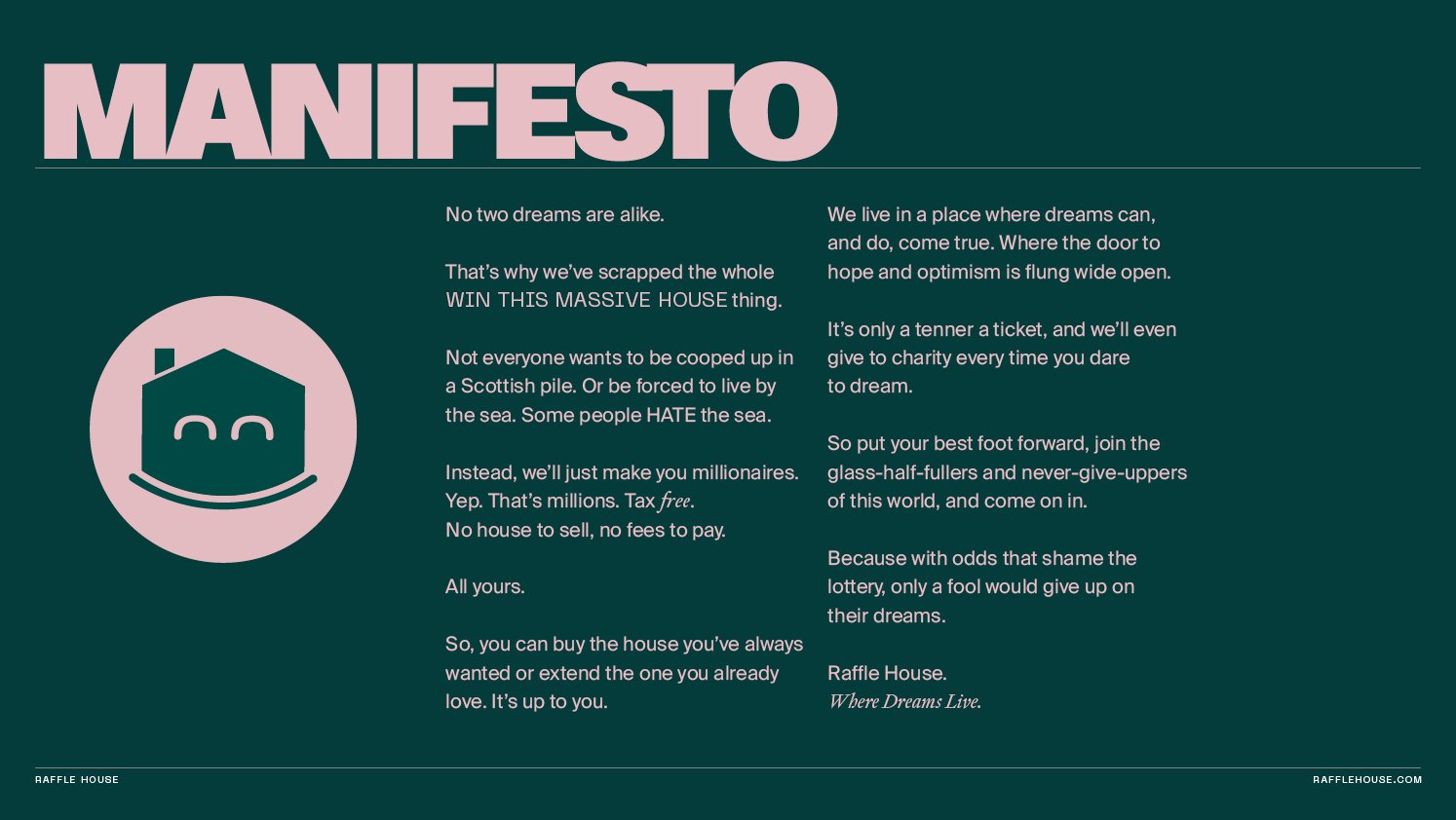
Raffle House came to use for a top to toe brand refresh and they needed it fast. Having direct access to us meant that the work gets done properly, quickly and efficiently.
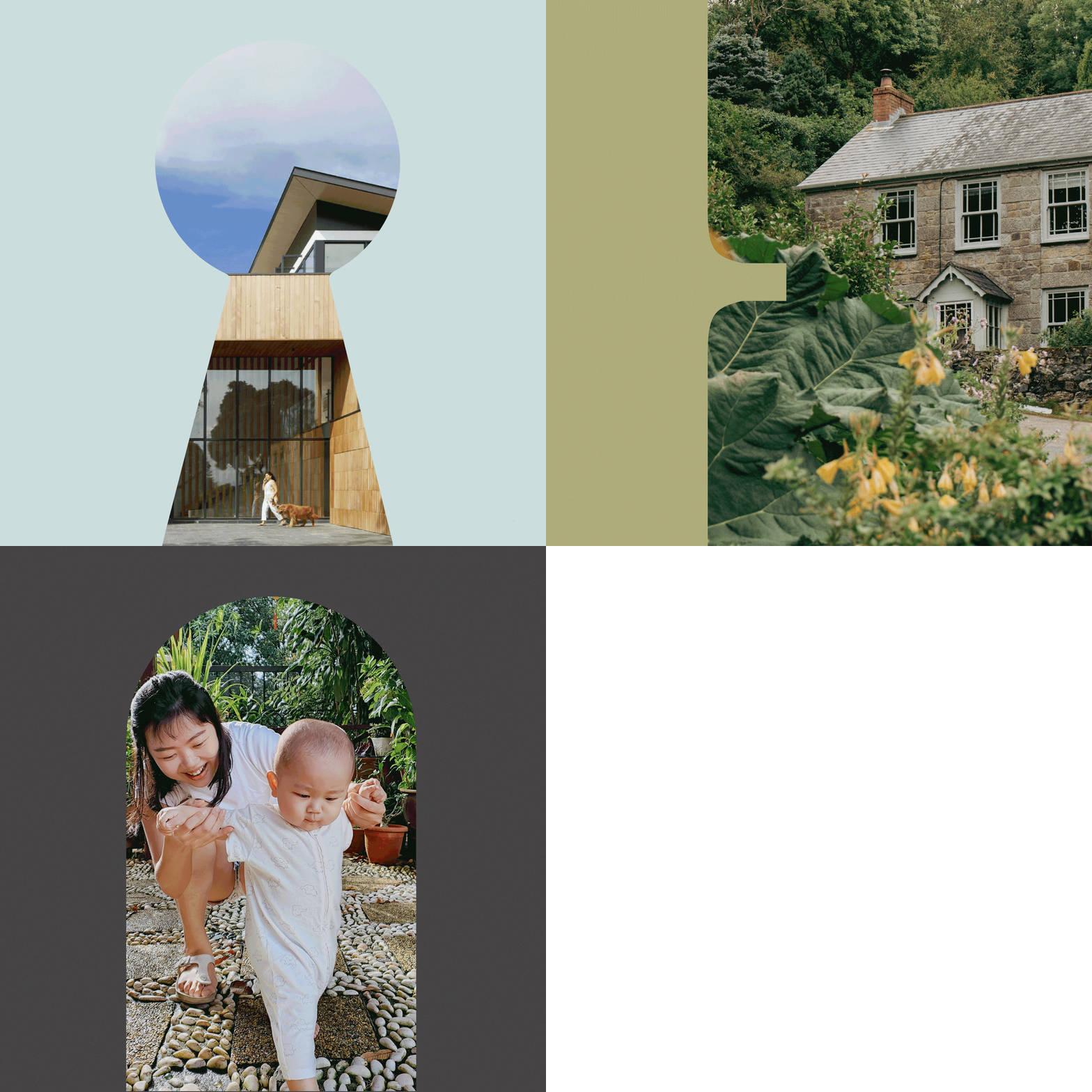
All they had was an endline “Where Dreams Live” and they were switching from raffling houses, to cash prizes. So we decided to sell dreams instead.
With so many get-rich-quick promises out there, they needed something imbued with charm, character, and trustworthiness. We created a central character named Happy House, around which the rest of the brand was then built. Along with a refreshingly down to earth tone of voice, they were able to stand out and be liked, amongst the competition.


